Creating Chocolate Button Effect Using CSS
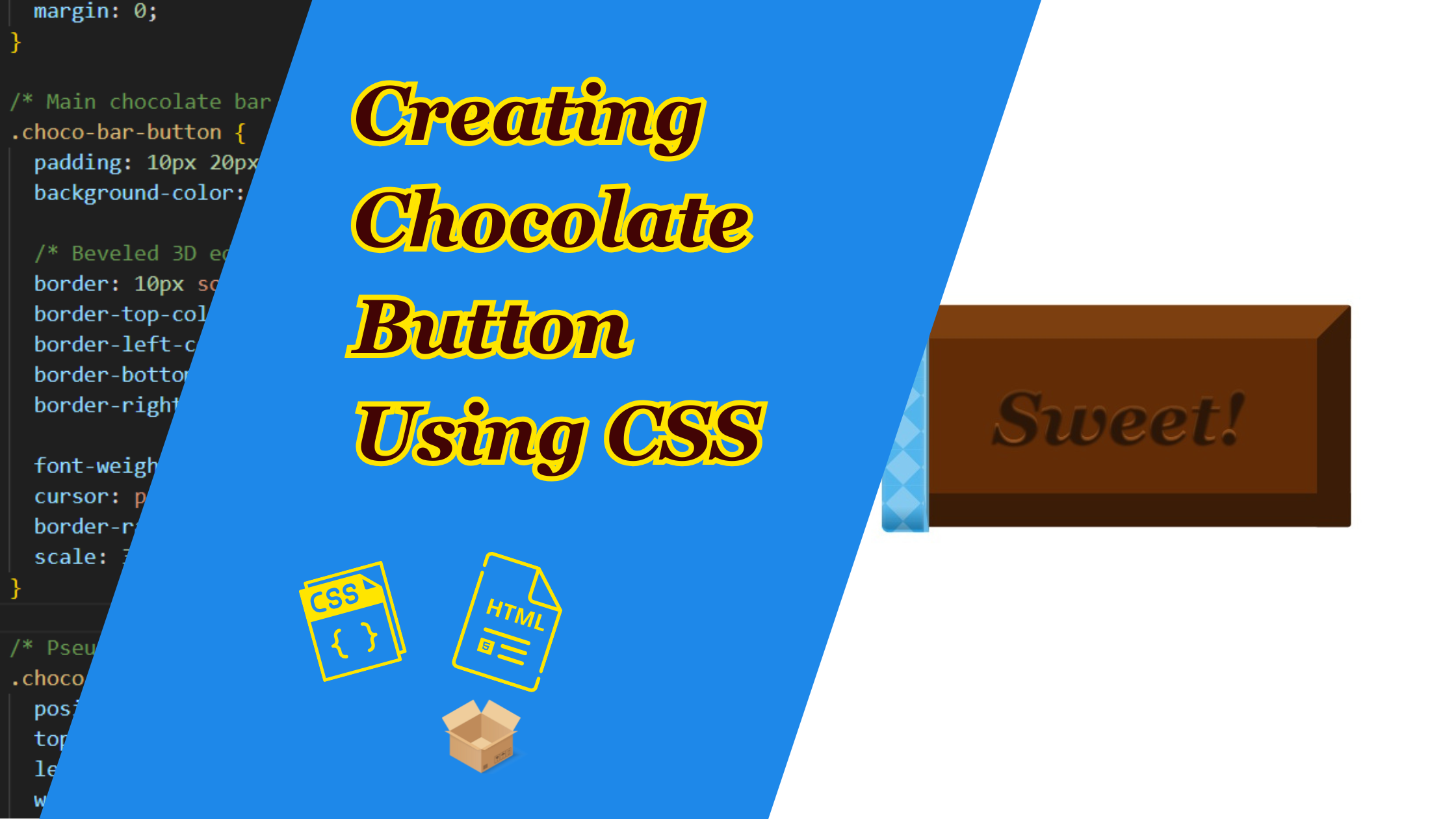
If you’ve ever wanted a button that looks good enough to eat, then you are in the right place. In this tutorial, we are going to learn more about HTML and CSS by coding a chocolate bar-inspired button that has a rich, 3D feel, and even a hidden “Open” label that animates when you hover!
Prerequisites
Before we get started, make sure you have a basic understanding of HTML, and CSS.
- Basic Understanding of HTML, and CSS: Familiarity with the fundamental concepts of HTML for structuring web pages, and CSS for styling and animation. This tutorial assumes a basic knowledge of these languages.
- Web Browser: Use a modern web browser like Google Chrome, Mozilla Firefox, or Microsoft Edge.
For the purpose of this tutorial, you can download the source files for the demo to help you follow along:
Note: As you test the source files, ensure that you load them within a suitable environment such that all the files are loaded. For offline use, we recommend that you use Live Server and vscode to load the files. Simply open the files in Vscode and run “index.html” using Live Server.
Demo
Here is what we are going to create. Move your mouse over the button and see the effect in action.
Lets Get Started!
Let’s start by setting up the basic HTML structure for our project as usual. Create an HTML called “index.html”, with a basic HTML web format, and add a style tag in heading and html elements for our button in the body.
Here’s the basic structure. It uses a span tag for the text and button element. We’ll animate everything else with CSS.
<!DOCTYPE html>
<html lang="en">

<head>
  <meta charset="UTF-8">
  <title>Chocolate Bar Button</title>
  <style>

  </style>
</head>

<body>
  <!-- Chocolate Bar Button -->
  <button class="choco-bar-button">
    <span>Sweet!</span> <!-- Visible text on the button -->
  </button>
</body>

</html>
Lets add the CSS
We will use a Flexbox to center the button on the page.
  /* Basic styling to center the button on the screen */
    body {
      background: #fff; /* White background */
      display: flex; /* Use flexbox to center */
      justify-content: center;
      align-items: center;
      height: 100vh; /* Full viewport height */
      margin: 0;
    }
2. Styling Chocolate Bar Base
This is the foundation of the button which creates a rich chocolate color with a bevel effect using border to create highlights and shadows.
/* Main chocolate bar button style */
    .choco-bar-button {
      padding: 10px 20px;
      background-color: #622c06; /* Chocolate-colored base */

      /* Beveled 3D edges using different border colors for depth */
      border: 10px solid #5a2d0c; /* Main border */
      border-top-color: #7b3f10; /* Lighter top border for highlight */
      border-left-color: #7b3f10;
      border-bottom-color: #3b1d07; /* Darker bottom for shadow */
      border-right-color: #3b1d07;

      font-weight: bold;
      cursor: pointer; /* Pointer cursor on hover */
      border-radius: 1px;
      scale: 3; /* Makes the button appear larger */
    }
3. The “Open” Overlay using ::before
This adds a decorative, patterned layer with a light-blue crosshatch and an “Open” label that animates on hover.
/* Pseudo-element ::before for decorative overlay and label */
    .choco-bar-button::before {
      position: absolute;
      top: -10.5px;
      left: -11px;
      width: 100%;
      height: 100%;

      border: 11px solid transparent;
      border-radius: 2px;
      padding: 0;

      /* Background with crosshatch gradient effect */
      background-color: #60bbec;
      background-image:
        linear-gradient(-45deg, transparent 75%, #1fa0e6 75%),
        linear-gradient(45deg, transparent 75%, #1fa0e6 75%),
        linear-gradient(-135deg, transparent 75%, #1fa0e6 75%),
        linear-gradient(135deg, transparent 75%, #1fa0e6 75%);
      background-size: 10px 10px;

      box-shadow: -2px -2px -2px #fff; /* Light highlight */

      /* Text styling for the "Open" label */
      content: 'Open';
      font-family: Georgia;
      font-style: italic;
      font-weight: 600;
      font-size: 28px;
      color: #fff;

      display: flex;
      flex-direction: column;
      justify-content: center;
      overflow: hidden;
      text-align: center;
      white-space: nowrap;
      flex-wrap: nowrap;
      z-index: 2; /* Behind ::after overlay */
    }
3. Hover Effect for ::before
Using the hover property, we can make the label “slide away” on hover:
 /* Animation effect when hovering - shrinks the ::before overlay */
    .choco-bar-button:hover::before {
      width: 1%;
      border-radius: 2px 0px 0px 2px;
      transition: 1s ease;
      border-right: 2px ridge #83cef3;
      font-style: italic;
      text-indent: 20px; /* Slides text to the right */
    }
4. Creating Glossy Shine using ::after
This gives the button a beautiful gloss overlay to mimic shiny chocolate. It is also style with a similar hover effect as the before element.
/* Pseudo-element ::after for shiny surface overlay */
    .choco-bar-button:after {
      content: "";
      background: linear-gradient(#ffffff3a 90%, #3130304c 99%); /* Glossy top with slight shadow */
      position: absolute;
      top: -10.5px;
      left: -11px;
      width: 100%;
      height: 100%;
      padding: 10.5px;
      border-radius: 2px;

      /* Inner highlight effect */
      box-shadow: inset 0px 1px 1px rgba(190,190,190,0.5);
      z-index: 3; /* Above ::before and button base */
    }

    /* Shrink effect for the ::after overlay on hover */
    .choco-bar-button:hover::after {
      width: 1%;
      border-radius: 2px 0px 0px 2px;
      transition: 1s ease;
      padding-right: 0px;
    }
4. Styling the Text
Here, the visible button label “Sweet!” gets a subtle gradient and shadow to look like candy writing.
  /* Inner <span> for the main visible button label */
    .choco-bar-button > span {
      background-color: #7b3f10;
      background: linear-gradient(#5a2d0c, #a55b22); /* Chocolate gradient */
      color: transparent;
      background-clip: text; /* Makes text take on background gradient */
      text-shadow: #2c1607 0px 1px 0.6px; /* Gives a slight depth */
      font-size: 20px;
      margin: 0;
      font-family: Georgia;
      font-style: italic;
    }
Conclusion
And there you have it ,a fully animated, glossy “chocolate bar” button crafted entirely with CSS. if you want to turn it into a real call-to-action, just wrap it in an <a> tag and link it wherever you need. Finally, feel free to drop a comment and share your creations. We would love to see how you style your own version of this sweet button. Happy coding!