Animating Buttons Using CSS Transitions
Let’s be honest for a second, the “Free Download” button might be the single most clicked, most beloved, most dangerously irresistible button on the entire internet. This is why in this tutorial we are going to animate this button using CSS to help you understand something about CSS animations and transitions especially if you need a “free download” button for your website. Lets dive in!
Prerequisites
Before we get started, make sure you have a basic understanding of HTML, and CSS.
- Basic Understanding of HTML, and CSS: Familiarity with the fundamental concepts of HTML for structuring web pages, and CSS for styling and animation. This tutorial assumes a basic knowledge of these languages.
- Web Browser: Use a modern web browser like Google Chrome, Mozilla Firefox, or Microsoft Edge.
For the purpose of this tutorial, you can download the source files for the demo to help you follow along:
Note: As you test the source files, ensure that you load them within a suitable environment such that all the files are loaded. For offline use, we recommend that you use Live Server and vscode to load the files. Simply open the files in Vscode and run “index.html” using Live Server.
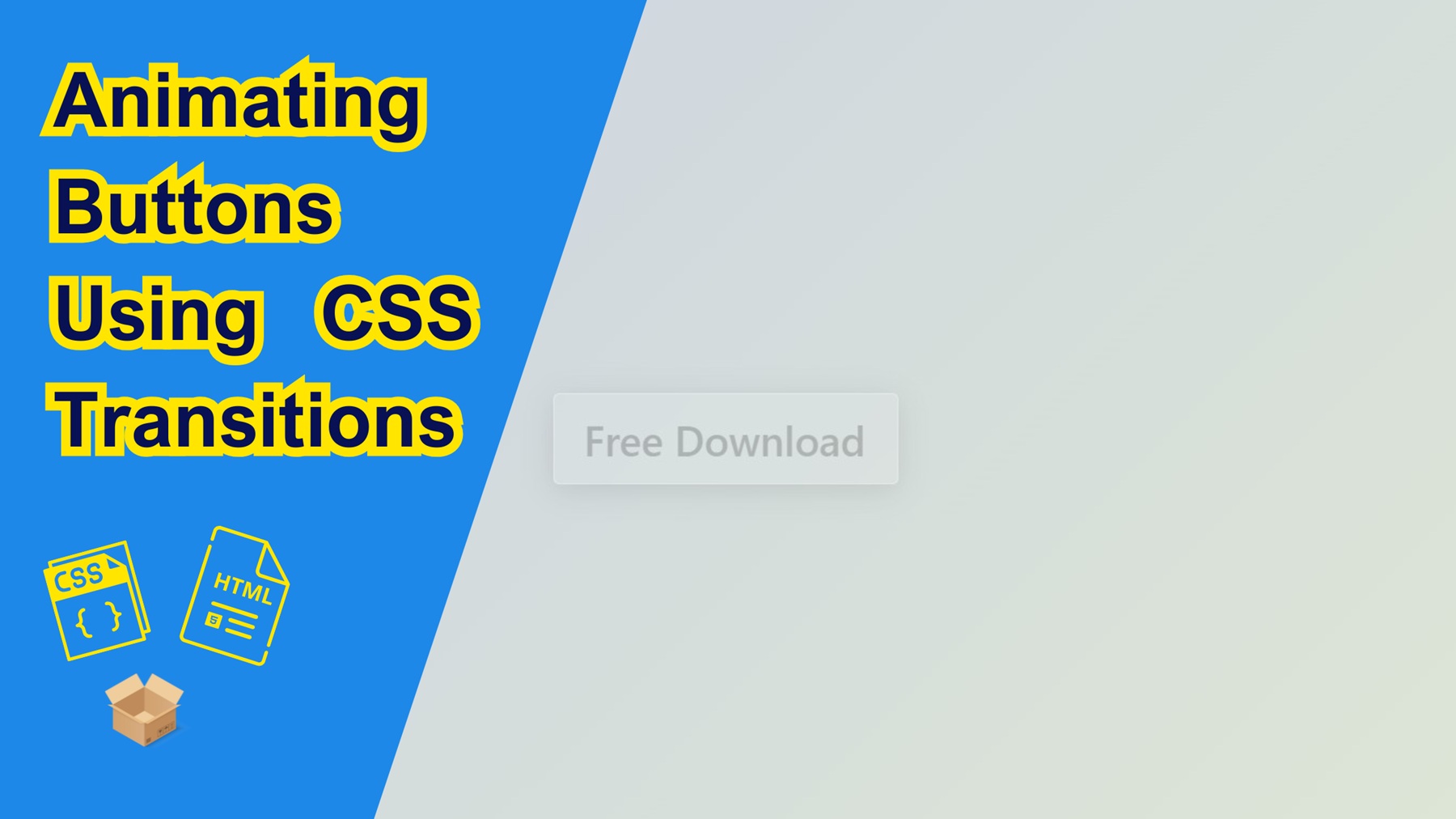
Demo
Here is what we are going to create. Move your mouse over the button and see the effect in action.
Lets Get Started!
Let’s start by setting up the basic HTML structure for our project as usual. Create an HTML called “index.html”, with a basic HTML web format, and add a style tag in heading and html elements for our button in the body.
Here’s the basic structure. It uses two span elements: one as the button container, and one for the button text. We’ll animate everything else with CSS.
<!DOCTYPE html>
<html lang="en">
<head>
  <meta charset="UTF-8">
  <title>CSS Button Animation - Glass and Shine Effect</title>

  <style>

  </style>
</head>

<body>

  <span class="button">
    <span class="text">Free Download</span>
  </span>

</body>
</html>
Lets add the CSS
Before styling the button itself, let’s make the page look nice. We’ll center the button in the middle of the screen and add a soft gradient background. This gives us a clean canvas to work with.
    /* Style for the body to center content and set background */
    body {
      margin: 0;
      height: 100vh;
      background: linear-gradient(135deg, #cad0e4 0%, #dfe8d4 100%); /* Soft gradient background */
      display: flex;
      justify-content: center; /* Center horizontally */
      align-items: center;     /* Center vertically */
      font-family: 'Segoe UI', Tahoma, Geneva, Verdana, sans-serif; /* Clean modern font */
    }
2. Styling the Button
Now it’s time to create the actual button. We’ll use a semi-transparent background with a blur effect to give it that glassy look. A soft shadow makes it float above the page, and Flexbox helps us center the text inside.
   /* Main button styling using glassmorphism */
    .button {
      width: 233px;
      height: 60px;
      border-radius: 10px;
      background: rgba(255, 255, 255, 0.1); /* Semi-transparent background */
      backdrop-filter: blur(8px);           /* Blurring behind element */
      -webkit-backdrop-filter: blur(8px);   /* Safari support */
      border: 1px solid rgba(255, 255, 255, 0.3); /* Semi-transparent border */
      box-shadow: 0 4px 20px rgba(0, 0, 0, 0.1);  /* Soft shadow */
      cursor: pointer;
      position: relative; /* Needed for absolute pseudo-elements */
      z-index: 1;         /* Keeps it above other lower z-index elements */
      display: flex;
      flex-direction: column;
      justify-content: center;
      overflow: hidden;   /* Clips inner content on hover animations */
      border-radius: 4px; /* Slightly sharper corners */
    }
3. Styling the Button Text
The button has a piece of text inside, “Free Download” , but we will start by making it barely visible. This lets us create a cool animation where the text gets revealed on hover.
/* Inner text styling */
    .button > .text {
      width: 100%;
      text-indent: 20px;     /* Push text slightly to the right */
      white-space: nowrap;   /* Prevents text from wrapping */
      -webkit-background-clip: text; /* Prepares text for advanced visual effects */
      font-size: 28px;
      font-weight: 600;
      z-index: -2;
      color: rgba(0, 0, 0, 0.2); /* Very light text, mostly invisible until animation */
    }
3. Adding the Shine Effect
What’s a fancy button without a little sparkle? We’ll create a shiny highlight using the ::after pseudo-element. It slides across the button when you hover like a glint of light catching on the surface.
/* Highlight shine effect when hovering */
    .button::after {
      position: absolute;
      background: #ffffff90;   /* Semi-transparent white shine */
      width: 80px;
      height: 100%;
      transform: translate(-6rem) skewX(30deg); /* Skewed shine starting off-screen */
      z-index: 2;
      content: "";
    }

    /* Slide shine animation on hover */
    .button:hover::after {
      transform: translate(18rem) skewX(30deg); /* Moves shine across the button */
      transition: 0.5s ease-in-out;
      transition-delay: 0.2s;
    }
4. Revealing the Real Text on Hover
Finally, we will use the ::before pseudo-element to slide in a bold, bright green background with white text. This makes the button feel interactive and rewarding like something exciting just unlocked. For both the before and after pseudo elements, we have add some transitions to help improve the animation effect on hover and make it smooth.
/* Button text reveal animation background */
    .button::before {
      position: absolute;
      top: 0;
      left: 0;
      width: 0%;              /* Starts invisible */
      height: 100%;
      border-bottom: 3px solid #17c25e;  /* Bottom border highlight */
      background: linear-gradient(#38f62a, #1adc6b); /* Green gradient background */
      content: 'Free Download';  /* The actual visible text on hover */
      font-weight: 600;
      font-size: 28px;
      color: #fff;              /* White text color */
      display: flex;
      flex-direction: column;
      justify-content: center;
      z-index: -1;              /* Behind main content */
      overflow: hidden;
      text-indent: 20px;
      border-radius: 4px;
      white-space: nowrap;
      flex-wrap: nowrap;
    }

    /* Expands the hidden ::before to full width on hover */
    .button:hover::before {
      width: 100%;
      transition: 0.5s ease;
    }
Conclusion
And there you have it a fully animated, glassy “Free Download” button powered entirely by CSS. It’s responsive, stylish, and adds a subtle wow-factor to any website or landing page. Want to turn it into a real download link? Just wrap it in an <a> tag and you’re good to go. finally, feel free to leave a comment and share any of your projects. We would love to see what you create. Happy coding!